Brand Identity at La Placa Cohen
Crystal Bridges Museum
of American Art
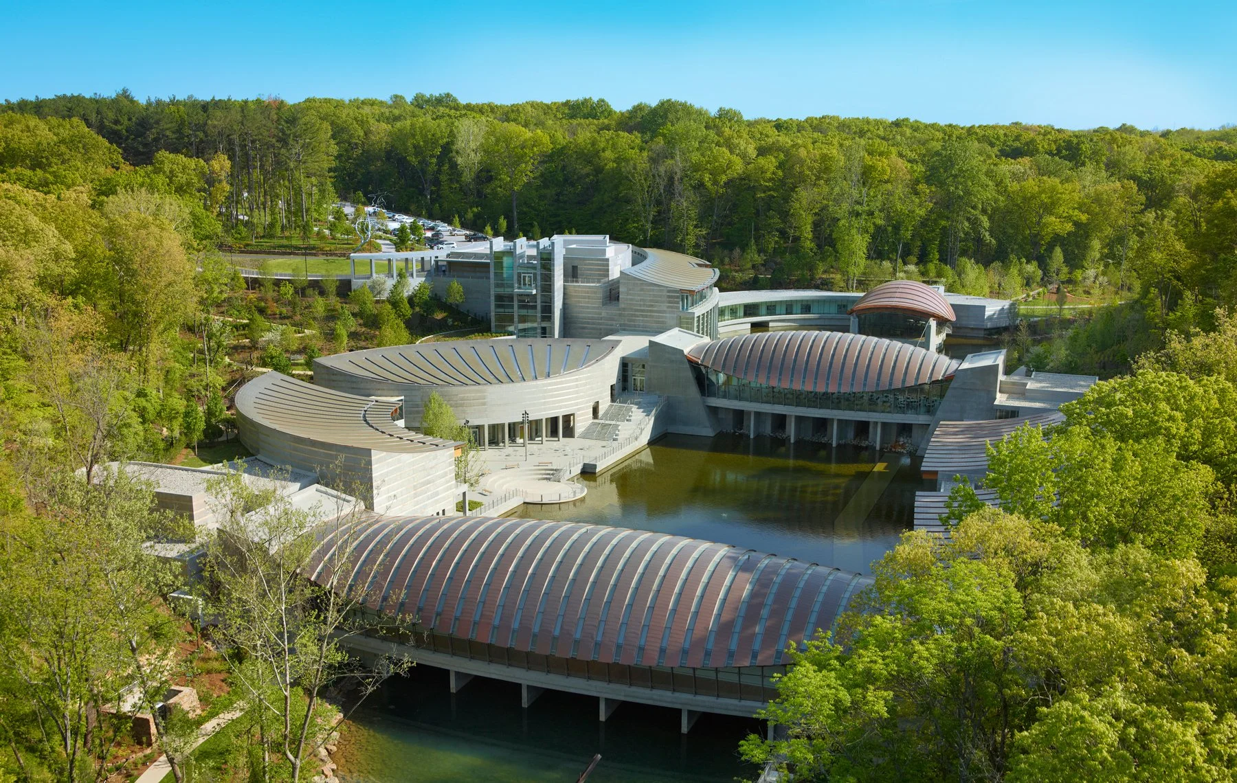
While at La Placa Cohen, I worked on the identity and design system for Crystal Bridges Museum of American Art. I studied the surrounding landscape along with the original site maps and building plans, which revealed how specific landforms and architectural layouts created the museum’s distinctive organic shapes.
Those forms, along with the core relationship between art, architecture, and nature, became the foundation of the visual system, expressed through organic geometry and a grounded color palette that reflects the experience of moving through the site.
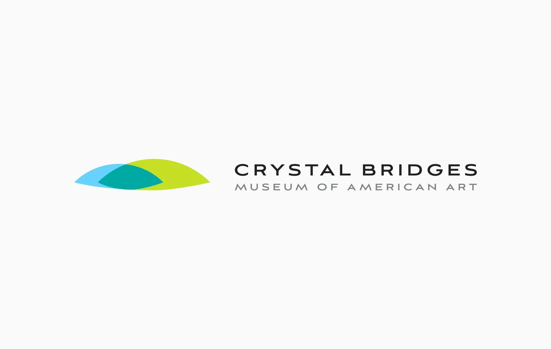

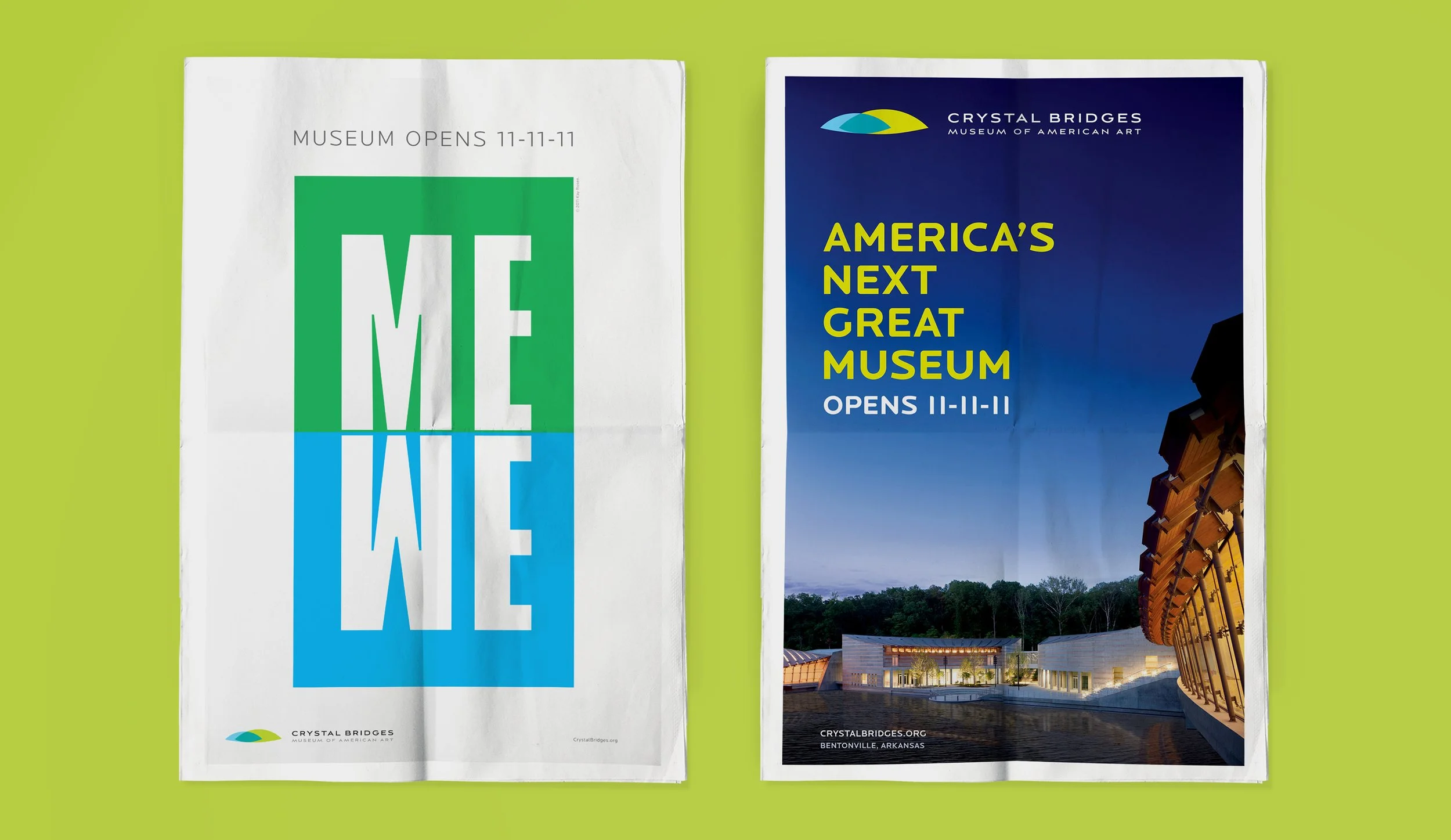
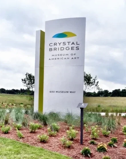
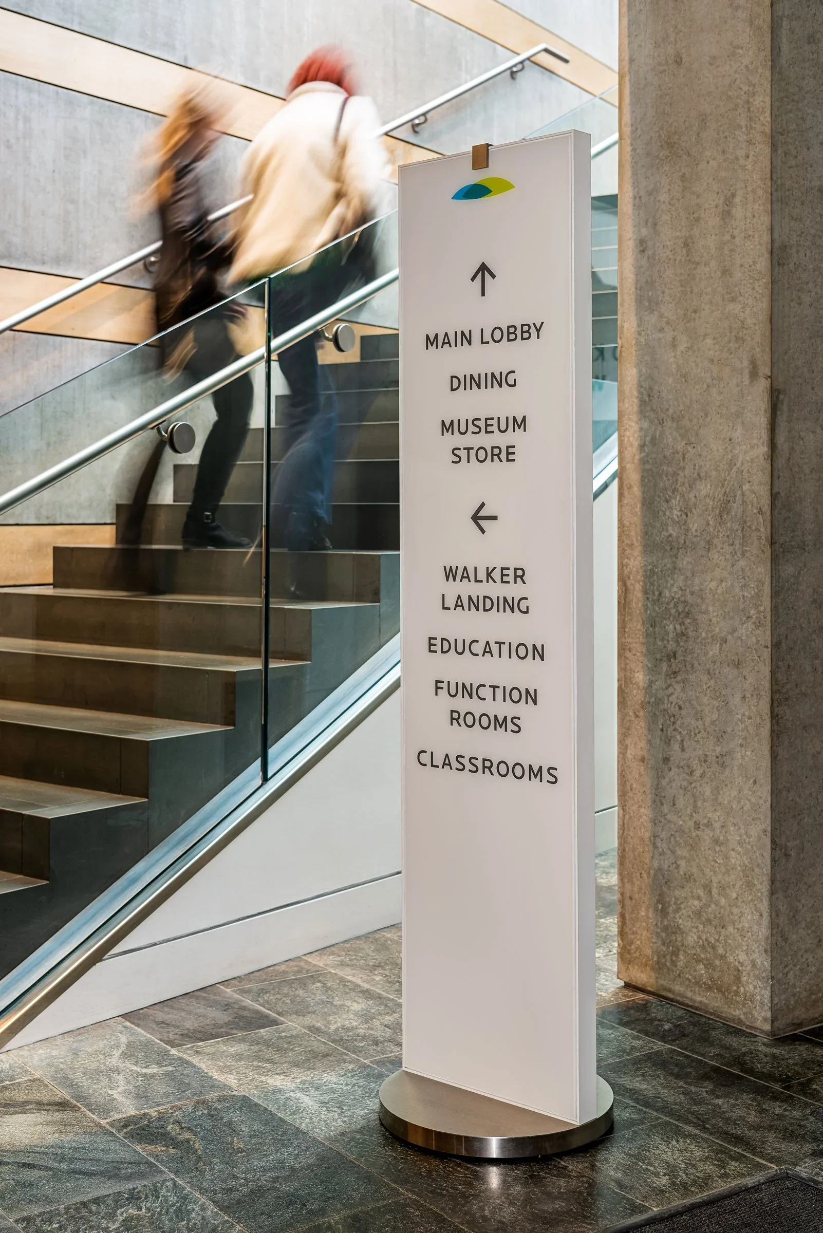
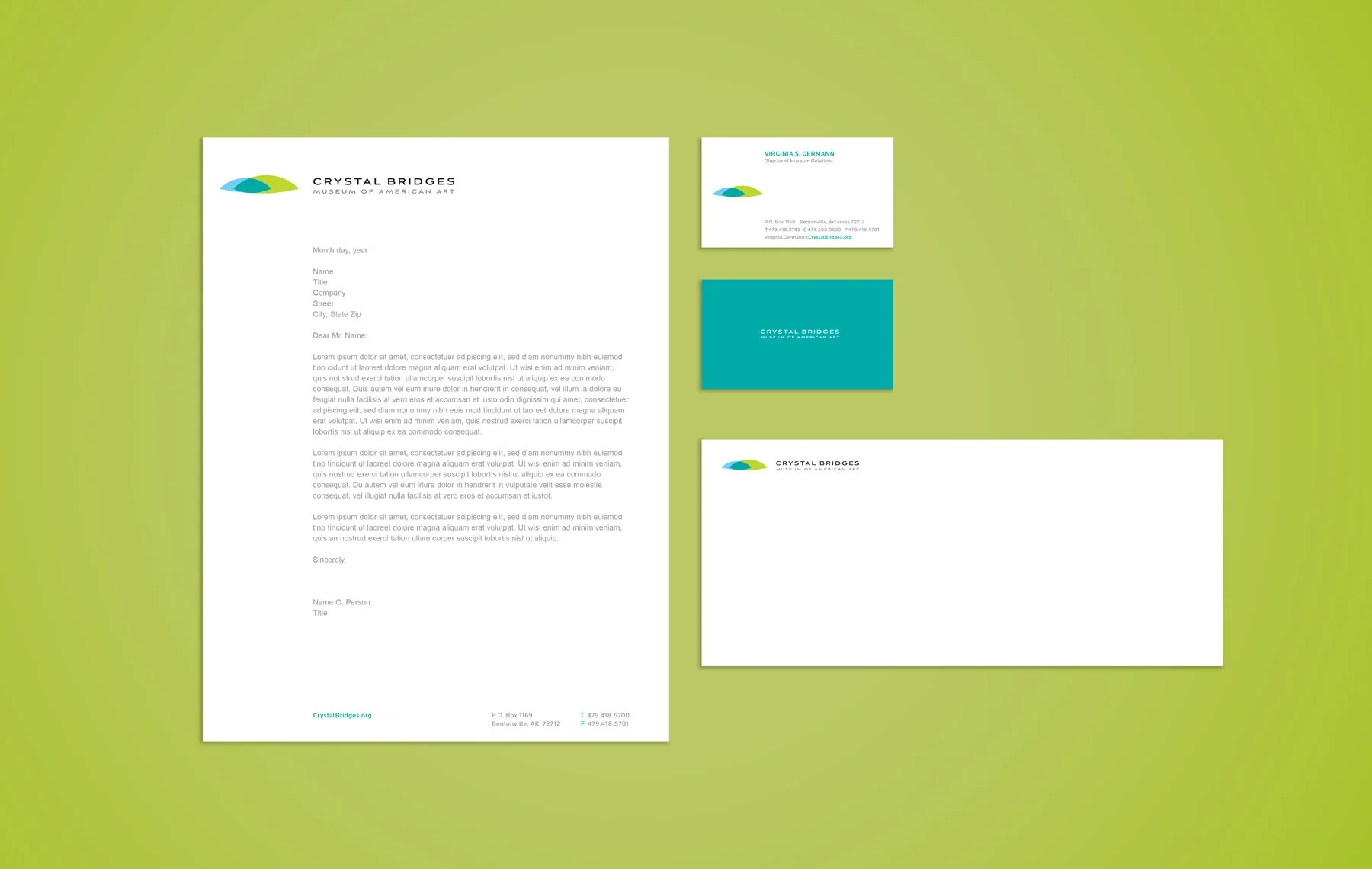
Aviano Sans was chosen for the wordmark for its strong, architectural feel and wide geometric structure, which pairs naturally with the organic shape of the mark. Locator was selected as the primary brand typeface for its clarity and clean lines, with letterforms that echo the geometry of the wordmark. Together, they create a system that feels modern, refined, and easy to read.
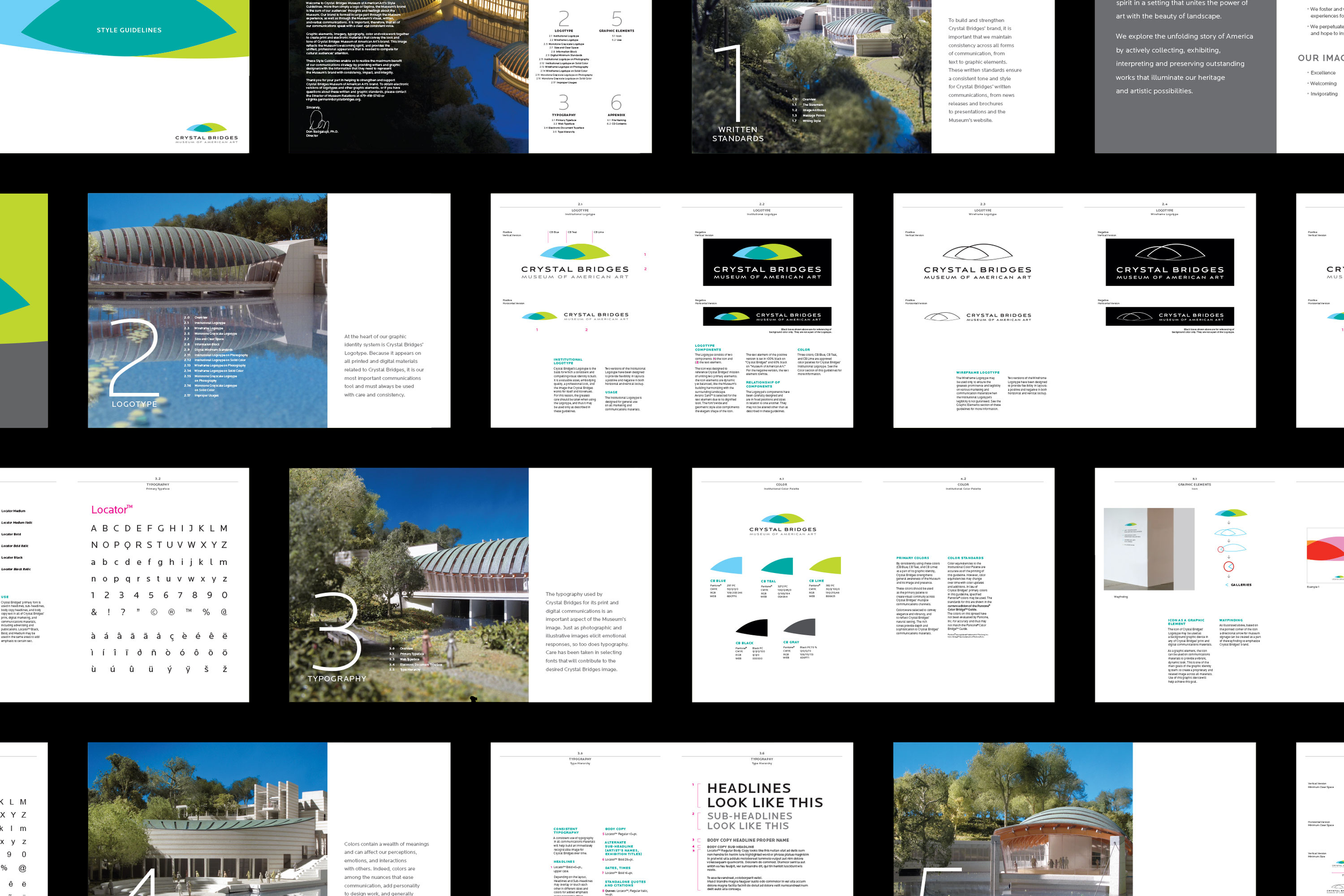
Inspired by Moshe Safdie’s bridge structures and their curved rooflines reflected in the water, the mark abstracts these repeated arcs into a single continuous form. It reflects Safdie’s philosophy of designing architecture that grows from the landscape and connects art, nature, and structure.